
It’s Only Paint
Paint is a strange thing. It doesn’t cost much, you don’t need to be an expert to use it, and it’s fully reversible. And yet, the fact that paint has such transformational power can leave paint decisions feeling like they are hugely important to get right. I’m not immune to this feeling. And while finding that perfect shade feels amazing, getting it wrong has its upsides too. It helps take the fear out of color selection, and reminds me of the words of disparagement that are in fact words of encouragement: It’s Only Paint.
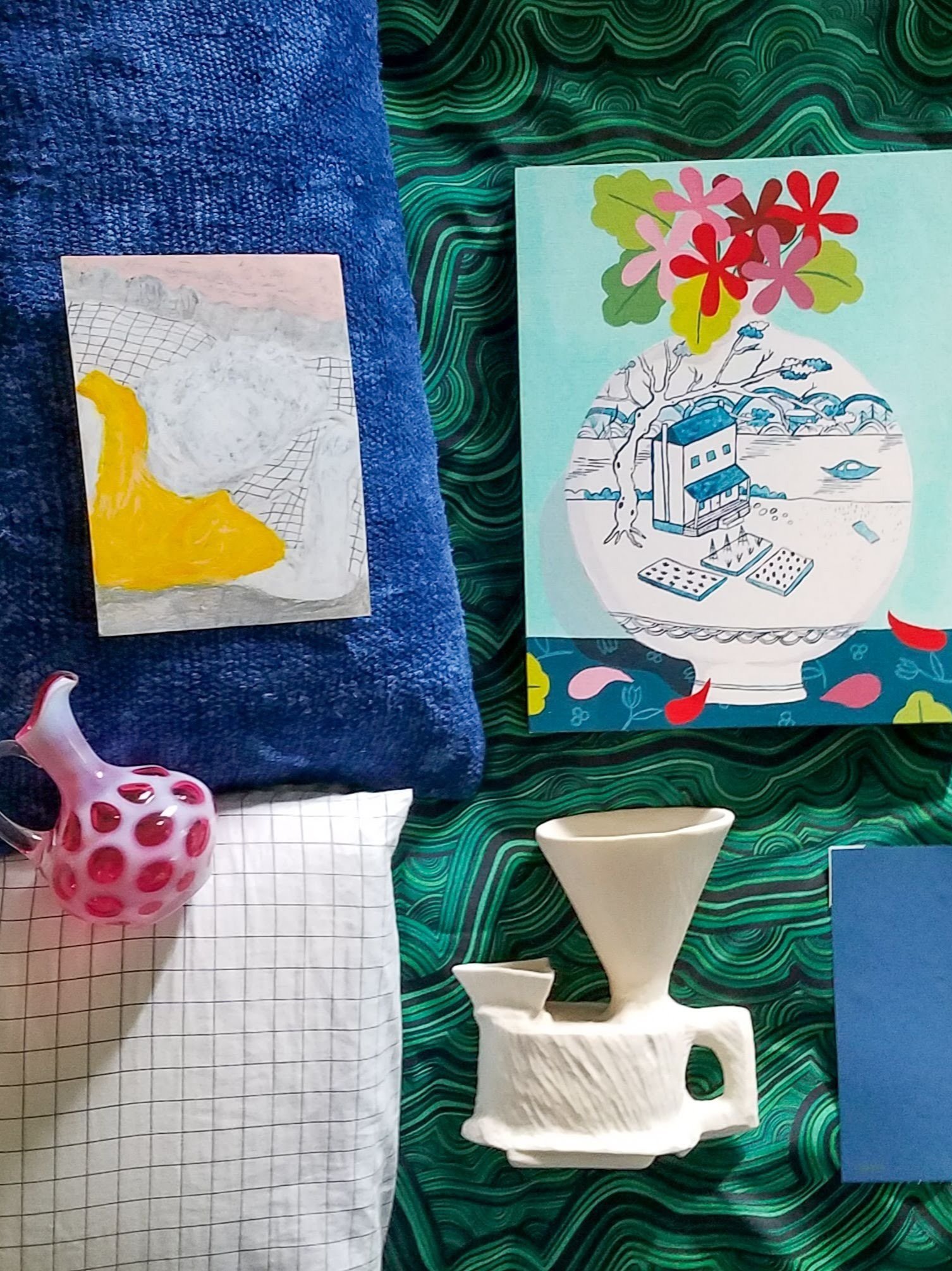
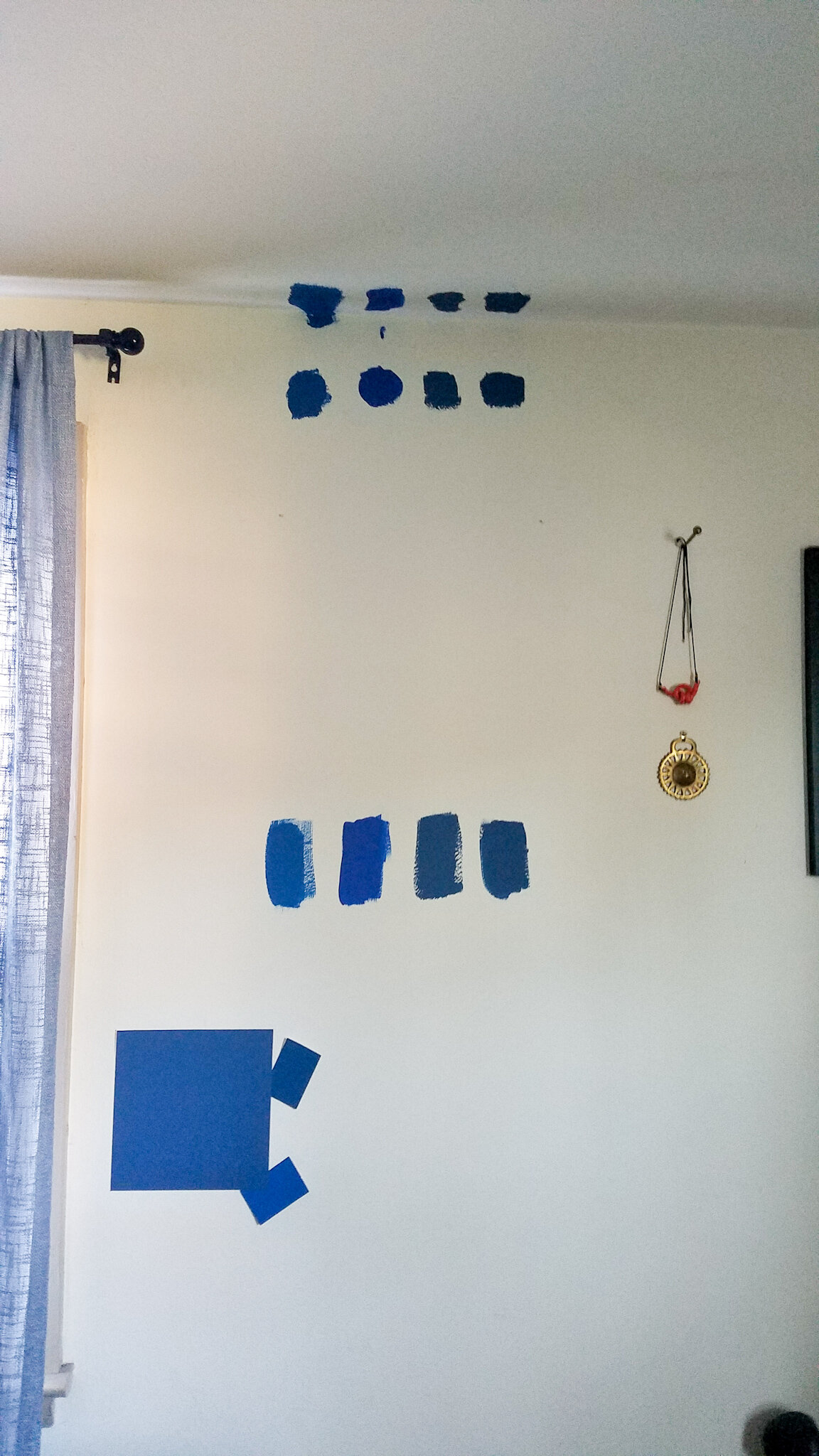
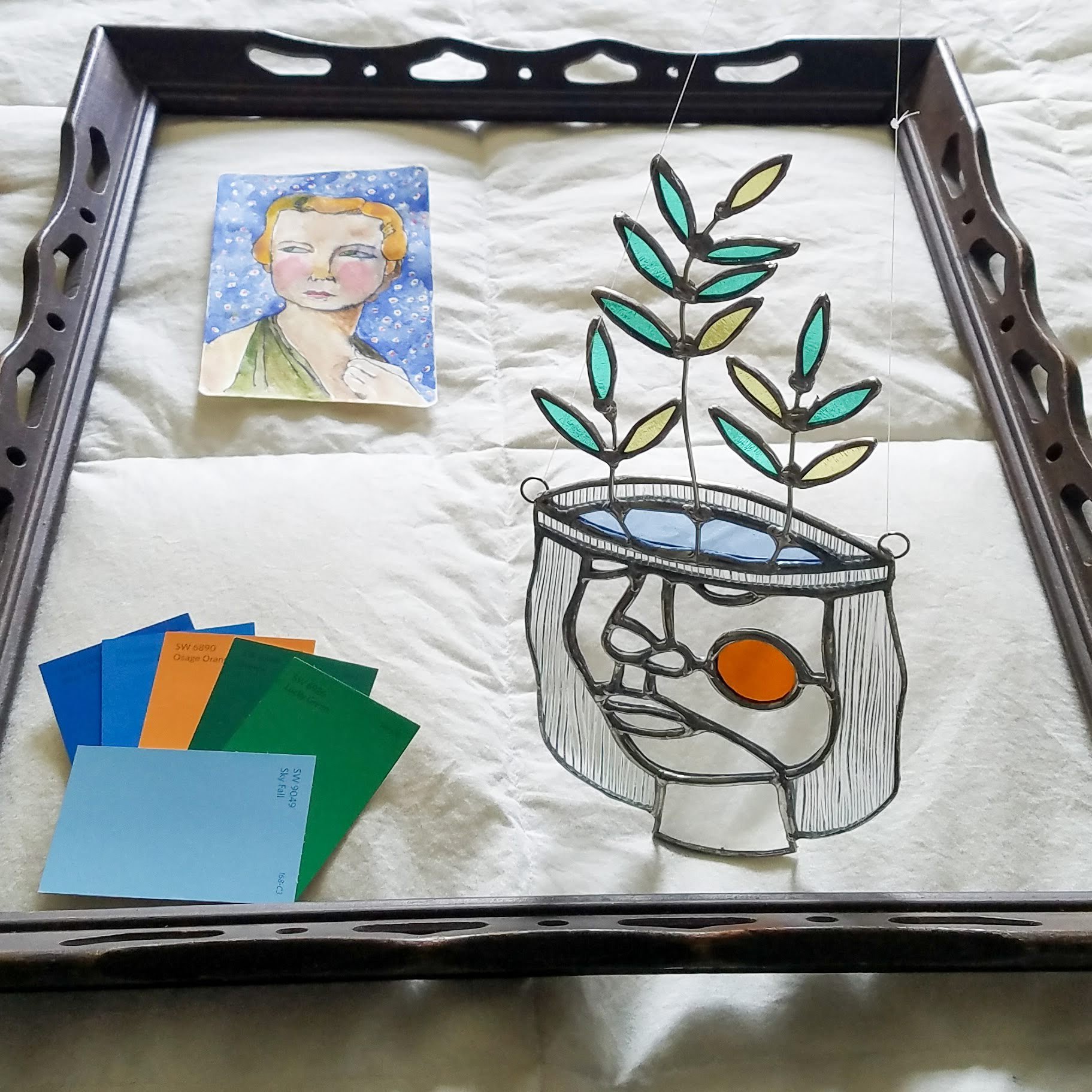
So where do I start when it comes to choosing a color? My two favorites are to think about art and mood. In the bedroom, I focused big time on mood. I wanted something cozy, which to me meant I wanted to go a bit darker. But I didn’t want it to come across as too serious, and so I needed a bit of saturation of color to keep the playfulness in my scheme. Too much of that saturation and it became too energizing for a cozy sleep space. There was a balance this color needed to achieve, which meant looking at lots of samples, and leaving them up for a while to see how each one felt at different times of day. I lived in color limbo for a long time with this color, much longer than usual. I thought I loved Hyperlink from Clare Paint when I started out, and after a few weeks on my wall that color looked too gray, especially once I took down my light blue curtains. I knew in a flat finish the saturation would come out of it even more, so I got 4 other colors to try from Sherwin-Williams. I had to color match in BEHR’s Dynasty line because it was the only paint sample base I could find in a flat finish. TIP – Be sure to match your desired finish in your sample can whenever possible. Glossier finishes will reflect more light, often making them seem brighter and more saturated, whereas flat finishes will absorb more light, making them seem darker and less saturated. And your room’s orientation matters here too. For the Northern Hemisphere, colors may look cooler in north-facing rooms and warmer in south-facing rooms. In the end, I sampled 5 colors and chose what I originally thought would be my last choice. It’s perfect. Going with this deep, yet saturated shade is so much bolder than I’ve been in my home in the past, and I absolutely love it. The fact that I could paint over it if it was a disaster helped me take the leap, and gave me the confidence to tackle my first wall mural. While my main color wasn’t directly pulled from art, my art did help me choose the shades of green, red, pink, (plus a tiny bit of yellow!) to include as accents throughout the room.

I’ve been on a BIG art kick, and sometimes a piece of art is the perfect inspiration for an entire color scheme, right down to the wall color. In the basement studio project, a gorgeous hand-embellished print by Mel Remmers was basically my whole color palette wrapped up in one piece of art. I knew the colors would all go together, because I could see them harmoniously in one place. Light blue became my background color, with greens, bold blues, and oranges making appearances through painted furniture. But I didn’t ignore mood here. Bright, saturated tones gave me the energized feeling that I needed in my creative studio space. TIP – when using highly saturated tones, you may need to bump up the saturation on your lighter “neutral” colors for them to read. My light blues were reading practically white against such strong colors, and going for a more saturated blue than I thought I wanted ended up looking just right.
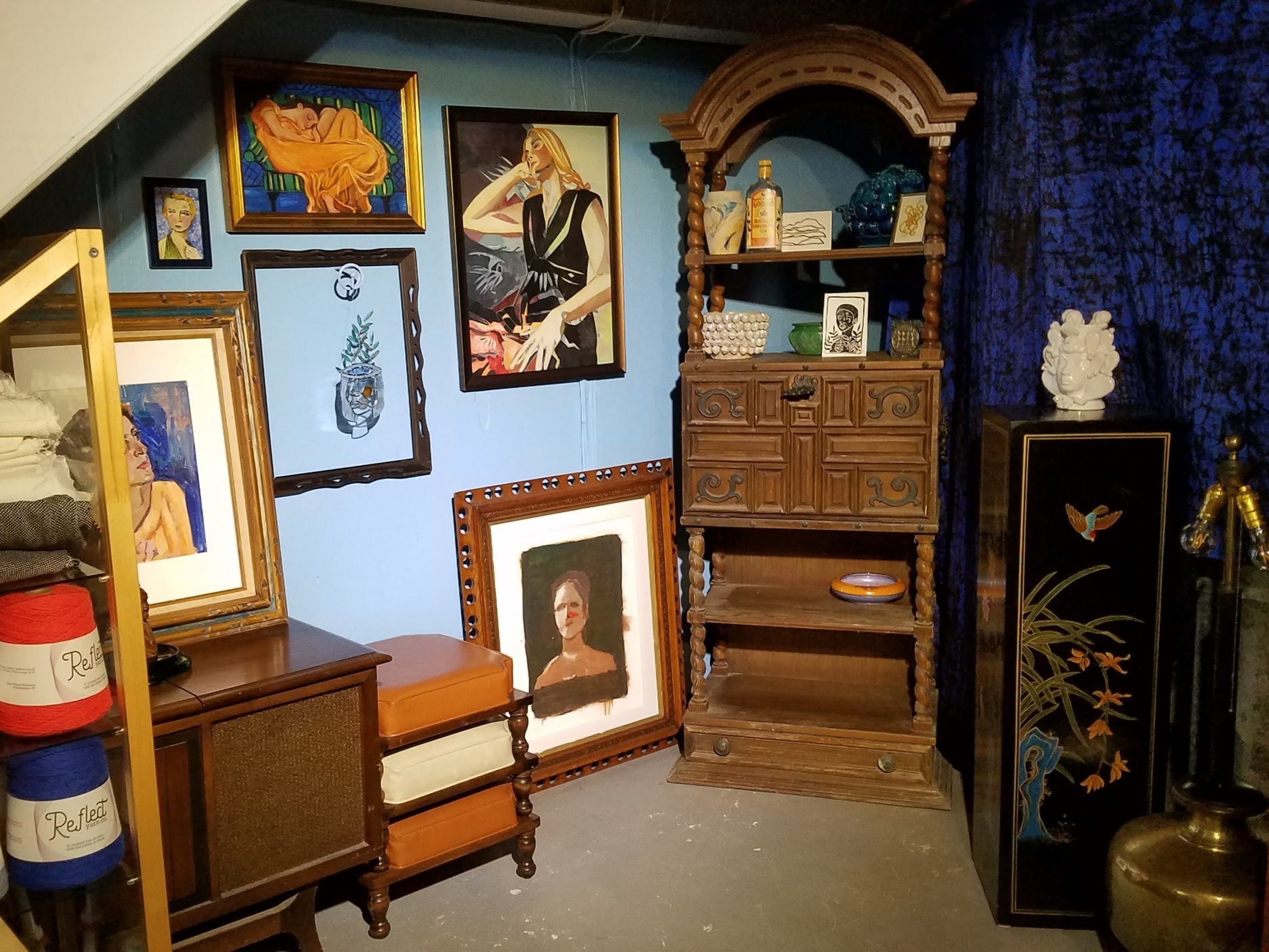
“Flaming June Green Couch” by Mel Remmers has all the right colors
Now that you have an idea of what colors you want, what brand should you get? These days availability is no small factor with paint shortages in play, though this overview will be looking at the factors where decision-making is required. I consider a number of things when I’m starting to look at paints including budget, color needs, paint quality, indoor air quality, finish durability, and finish sheen. I’ll go through each of these to discuss how I make my decisions, and why painting usually isn’t a one-brand-fits-all solution.
As a starting note about budget, my personal budget tends to be relatively low - in the $40 - $60 a gallon range for paint, which leaves me with hardware store brands (like BEHR and Valspar), Sherwin-Williams, and Clare Paint. For my purposes, I have been able to find colors to suit my needs within my price range, though there are MANY other paint brands out there at higher price points if you have the budget for it. Depending on your application, these might be a better fit for your color needs, for example if you’re looking for a large range of hues for historical properties, or if you are looking for strong depth of tone in a desaturated color. Farrow and Ball is a standout in this category, though I’ve never used their paint myself. I’m going to stick to talking about my experiences with comparing the paint brands within my budget range as I go through the other selection considerations.
When I first bought my house 12.5 years ago, my budget was LOW. I settled on my house on a Friday, and by mid-day Monday my company shut down its servers, announced that it was heavily downsizing, and started bringing people into the conference room one by one. Layoffs were based on which project you were working on at the time, and less than 1 business day after closing on my house I was out of a job. It was not ideal. We used budget BEHR paint in pretty much our entire house and it was … fine. It took 3+ coats with substantial touchups on average. Being tight on budget and flush with time, this wasn’t a bad solution for our situation.
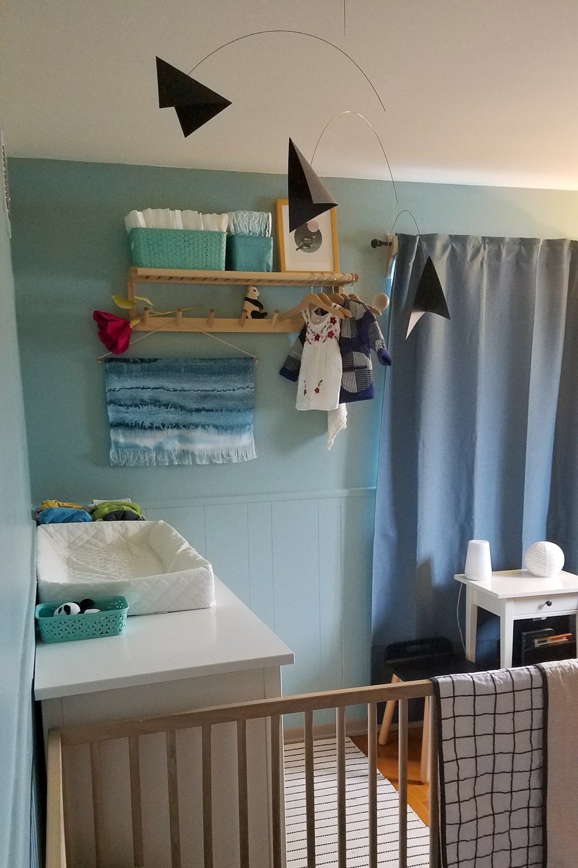
I didn’t find myself painting my own house again until 8.5 years later when we were expecting my second daughter. My budget and I were both ready to seek alternative paint types. Clare Paint was new on the scene, I loved their movable and generously sized sample patches, and it is a Black Woman Owned Business. Having developed a better understanding of purchasing ethics by this time, I loved supporting this brand over the big hardware stores. Especially since it had come to light that the one closest to my house made large contributions in areas that I wouldn’t want my money supporting. The icing on the cake for me was that this paint has Zero VOCs. VOCs are Volatile Organic Compounds, and simply put it refers to the off-gassing of chemicals, which are then released into the air. Think, new car smell. Or new rug smell. Or in this case, paint fumes. For my little one’s nursery, this was very important to me. I didn’t do the paint job myself when I was pregnant, though our friend (who once worked for a professional painting company) was waxing poetic about the paint coverage when he helped us. I was so comfortable when checking in on the progress that I did some of the touch-ups myself, and the lack of paint fumes was remarkable. If you’re needing to paint a room and sleep in it soon after, I can’t recommend Clare enough for indoor air quality. It took 2 coats.
When we used BEHR paint in our bathroom around the same time, my husband remarked at how much better quality the Clare Paint was. Being a bathroom, it has more demands on surfaces in terms of moisture and cleaning, and the BEHR paint has not held up terribly well in this application over the last 3 years. I’ll likely be painting this room again before long. Clare paint has increased in price by about $10 per gallon since I first tried it, and I still find it well worth the superior coverage, especially when you’re using fewer coats. The tradeoff for those great prices is that Clare Paint arrives by mail only, has a limited range of colors, and only has two finish options. Just wall paint and trim paint. No flat, no high gloss. For typical applications when I don’t need to look through a whole fan deck of choices, Clare is my go-to place to start. I have since used Clare in my Family Room, Entryway, Kitchen, and Bedroom walls and have been so happy with the quality and coverage for the price.
Saturated Colors from Sherwin-Williams
In terms of color selection, coverage, finish options, and durability options, I love Sherwin-Williams. They have a variety of different paint types, which you can customize per your needs. Their less expensive paints will still cover better than Valspar or BEHR, and their more expensive paints ($60-$70 a gallon) have superior durability (like enamel paints for furniture). I used the pricier Sherwin-Williams (Emerald) for the ceiling of my One Room Challenge bedroom, and I was THRILLED to need one thick coat and one thin coat to cover the whole thing. Not having to roll the ceiling a third time was worth quite a lot to me and my aching neck at that point, and the way the flat paint went on was amazing. Definitely splurge-worthy for me. My wall in the same paint finish covered in basically one coat plus a once-over. I used some of their lower priced paints for my basement One Room Challenge, and I was very happy with them too. And the associates in-store can walk you through the real difference in the paint types. I have found them to be very helpful in determining when to save and when to splurge on different formulations.
BEST BUDGET – Sherwin-Williams: This may be a surprise choice in the budget category, but hear me out. When you use fewer coats, your gallons go further. If you find yourself needing a VERY small amount of paint and don’t mind putting in the extra coats, you may do fine with Valspar or BEHR, but if you’re going to be dipping into that second gallon, you may end up spending more buying 2 gallons of the budget stuff over one gallon of a paint with better coverage.
BEST AIR QUALITY – Clare Paint: This one’s not even close. I was glad to have the option of a flat paint for my bedroom ceiling, but I was also glad to have a sofa to crash on so that I wouldn’t have to sleep in that room for a few nights. With Clare Paint, I could breathe so easy that I felt amazingly comfortable using it in my home when I was pregnant and with little ones around.
BEST COLOR SELECTION: Sherwin-Williams: The fan deck is an amazing resource (ask at the desk if you don’t have one). While hardware stores seem to group colors based on collection, the in-store wall of color samples at Sherwin-Williams is so well-organized by hue that it’s a piece of cake finding colors of the right saturation level to coordinate with one another. And if it’s not quite right? You can ask them for a color at 25% , 50% , or 75% strength to suit your individual project needs.
On that note, if you’ve been contemplating something bold, new, or even just a refresher, go for it! It’s only paint! You can always paint over it if it’s not the right shade.

Whipped, by Clare Paint
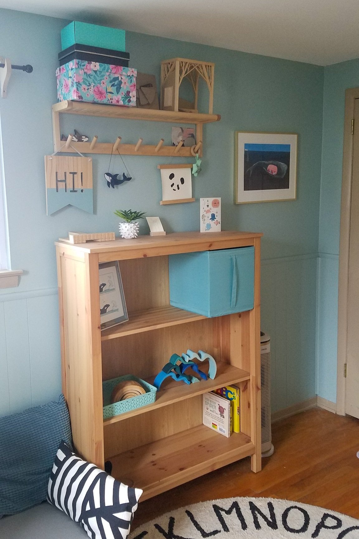
My go-to basic is Whipped by Clare Paint, and I keep thinking about Clare’s Views (in my daughter’s nursery) for totally hypothetical project ideas. When I see a color I love, I just can’t help myself! Do you have a favorite color that you keep coming back to?