
Prepping For Paint
Usually, I love painting. Or at a minimum, I don’t mind it. I like doing edgework best, and get into the zone of the smooth, little details. This time around, the paint has been looming over me as this terrifying idea of a job. It’s the darkest paint color I’ve ever chosen. I’m painting a dark ceiling. AND attempting a wall mural. It’s the biggest job of my whole ORC space, and it makes sense to do it early. Oof.

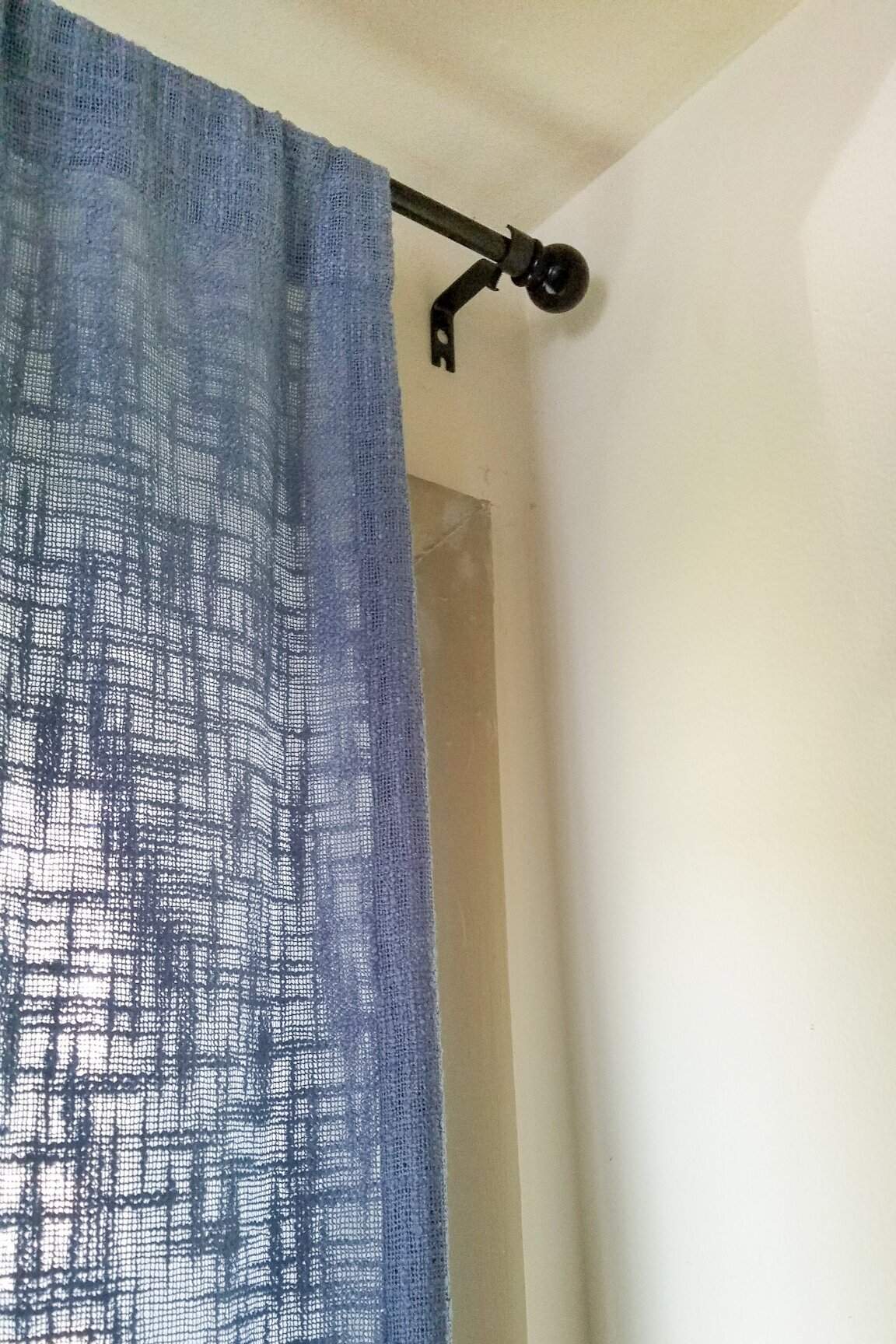
So I took all of my energy and did the most logical thing I could do with it. I worked on basically every room in my home except the ORC bedroom. I changed the curtain rod hardware and curtains in my living room AND my daughter’s room, I reorganized and decluttered my dining room, I bought more art for elsewhere in my house. And I didn’t document ANY of it. Oh wait, did I say I did the most logical thing? Yeah, no. I definitely didn’t do that. At least I was productive, eh?
After my wildly misdirected productivity ran its course, I decided to get it together and actually prep for paint. “Prep for paint” became more of a to do list of minutia involving moving each piece of furniture away from the walls, moving some furniture out of the room entirely, getting those stored items in a place where they’re not in the way, wiping down all the walls and trim, and coming up with a full gameplan for what order I’m painting everything and why. Oh, and actually choosing and ordering my paint.
That last bit ended up being trickier than I thought it would be. I had a paint sample that I really liked, Hyperlink by Clare Paint. I’ve painted a few rooms with Clare Paint now and it’s easy to work with, the coverage is great, and their trim paint doesn’t get all gummy before you can spread it properly. BUT there are only two finishes: A wall finish and a trim finish. I considered color matching it in a flat finish for the ceiling, but after staring at it on my wall for far too long, it started looking more gray than blue. Sheen impacts the appearance of color in a paint, and oftentimes you lose some of the depth of saturation in a color when it’s in a flat finish. So in the end I decided that this paint color was not going to work for the space, since I was losing that saturation in the eggshell wall finish swatch already. I will be using Clare’s “Whipped” on 3 walls, including the base for the mural, and will be going in another direction for the ceiling, one wall, and the top layer of the mural.
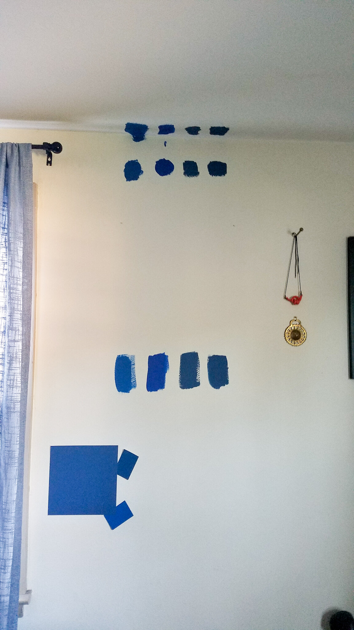
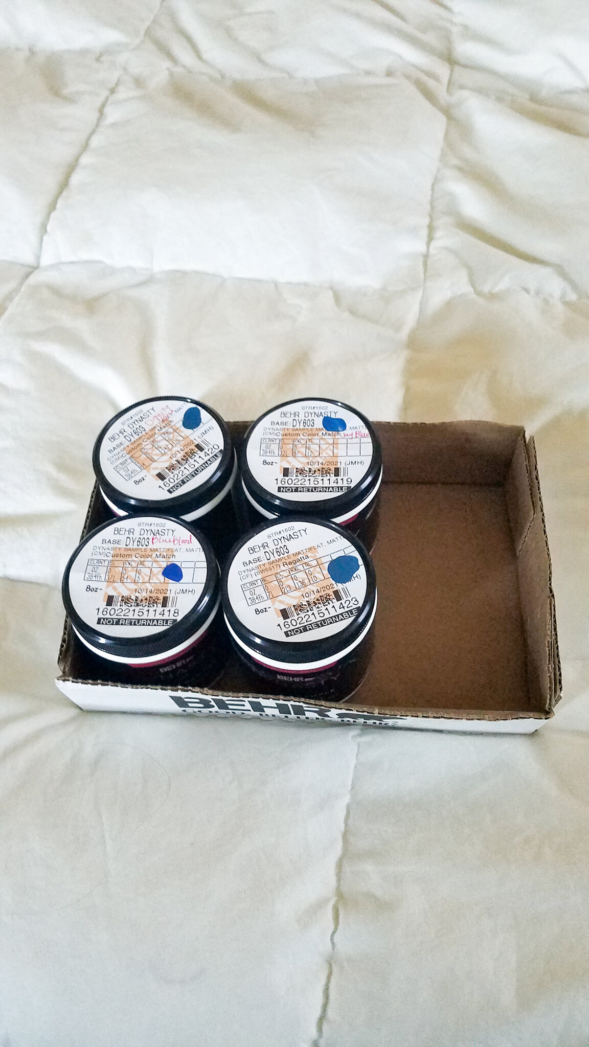
In search of new blue paint, I got 4 sample colors from Sherwin Williams color-matched at Home Depot, where you can get sample cans of flat finish paint!!!! I know those exclamation points seem excessive, but in a paint shortage, when most places ONLY do a satin finish in sample containers if they do them at all, I could actually get flat paint samples in Behr’s Dynasty line to see what these colors will really look like in my space!
A flat finish for the ceiling is so important in a space like mine, as the existing finish would need to be PERFECT to tolerate a sheen, especially in a dark color. Light is getting thrown at the ceiling from every angle, and my low ceilings are far from perfect. I’m so glad that I went this sample route, because each painted patch really did look different than its satin finish color card, and I started leaning toward a totally different color than I thought I would. My current top choice (Dignity Blue) was my fourth choice out of four going into this trial run. I almost didn’t sample this color at all.
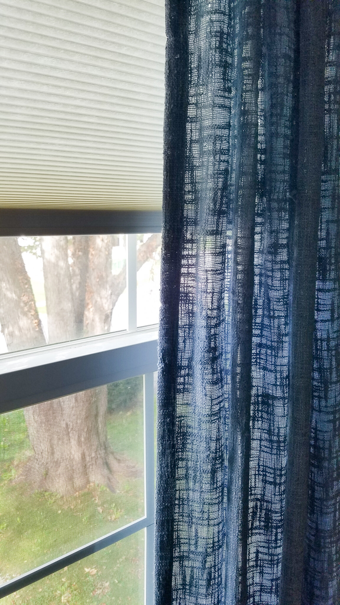


In true indecision fashion, I decided to tackle one more room element before making my final paint selection: window treatments. The new sheer curtains that I’ve selected are VERY sheer, so I need another layer behind them to help filter and block light, and to add some much-needed privacy. I am moving my bed under a window, so the sheers at that location will receive a dark blue blackout shade to help create a consistent backdrop for the pattern in front. I’m using light-filtering honeycomb shades with vertical striped sheers in the other two windows. I currently have light blue, textured linen curtains everywhere, which means that I’m viewing all of my paint samples in a lighting condition that is very different from the one in my final design. I’ve convinced myself that I need to at least get those honeycombs up to get an idea of what these color swatches will look like in the new scheme. Besides, locating and hanging the new hardware BEFORE I tackle painting will mean that any adjustments will become part of the wall prep rather than a patch on my newly painted walls and trim.
So because everything took forever this week and I’m here on a Sunday instead of a Thursday, I’m giving you all a peek at this curtain backdrop, plus what I have in mind for this mural I keep mentioning!

I decided to carry the motif of the mural above the new picture rail as well to keep the sense of movement going all the way around the room. The sheer curtains, printed with a portion of Van Gogh’s “The Olive Trees” play off of this movement as well.
I ordered used acrylic curtain rods to reduce my use of new plastics while still benefitting from the disappearing horizontal moment at my vertical curtain stripes. I’m so pleased with them! They are in excellent shape, include all the necessary hardware, and it’s adjustable in terms of how far it sits off the wall. I plan to leave off the gold end caps and keep the rod end condition the clear acrylic. I have one window that butts right up to the wall, and so the uneven rod length on each side will benefit from this disappearing end condition moment as well.

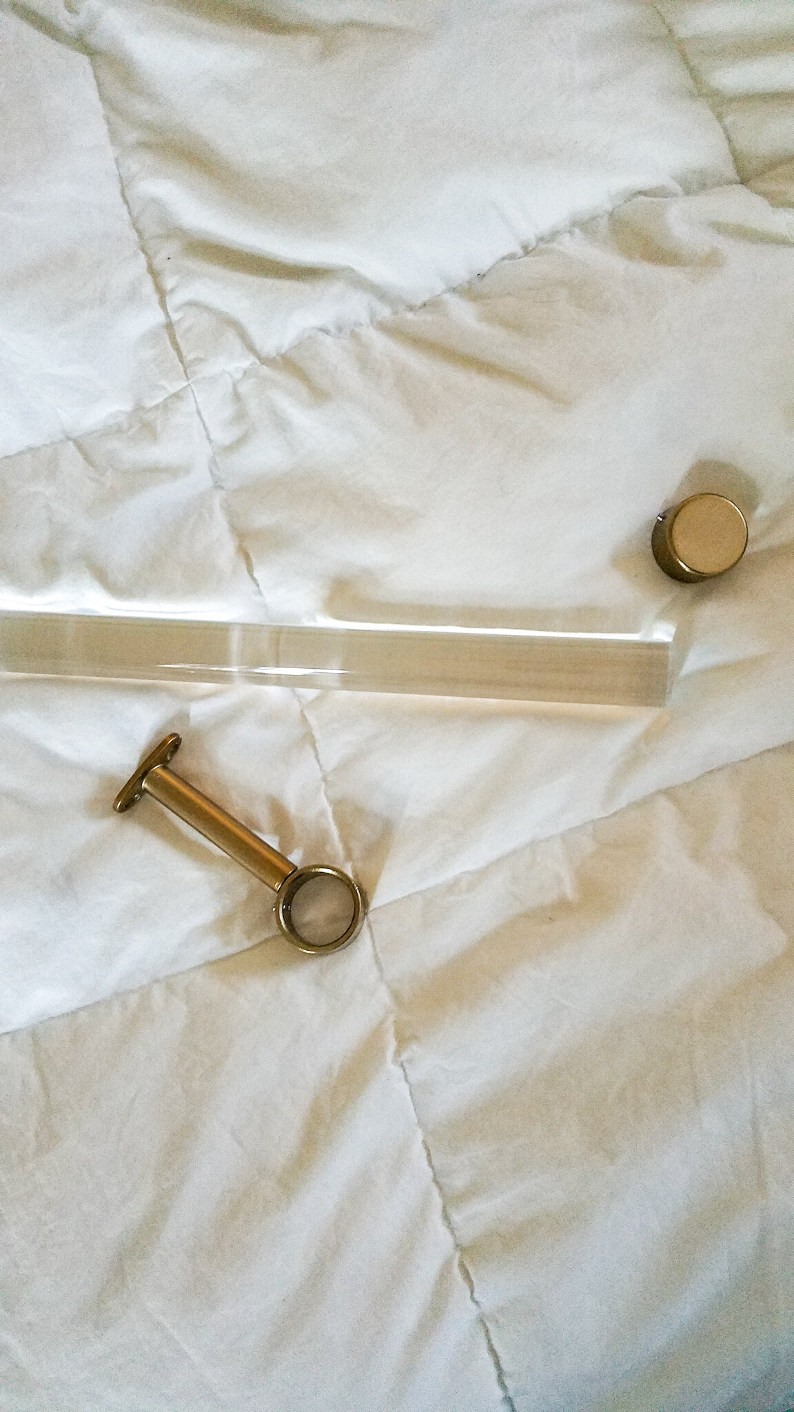
I try to shop small and local where I can, but in this case buying a used item off of Amazon gave me the flexibility I needed. I could purchase online, return for free if the condition was other than as stated, and I was able to get the look that I want without adding to all the new plastics being created and sold every day. This consideration is so important to me - these plastics will be on the planet forever, so I’m making a commitment to consider their full life cycle. As an added bonus, I saved a little money in the process and these beauts are staying out of a landfill.

Here’s to getting some paint on my walls this week! One of the things I love about the ORC is that all the Highs and Lows and Don’t Have Much to Shows in everyone’s projects remind me that it’s OK to be where you are, even if it’s not where you wanted to be. We’ll get there. Do you have an intimidating project that you need to start? We’ve got this!
Check out The Glad Suite on Instagram and be sure to check out all the other amazing transformations going on over at www.oneroomchallenge.com/orc-blog
*Fabric Design by Jenna Black
If you’re an ORC participant, please leave your Blog name / Instagram info in the comments so that we can come cheer on your project!